
Exhibition at Nicholls
State University
by Dr. Ashley Busby, 2019
Exhibition at Nicholls State University
by Dr. Ashley Busby, 2019
Shown together for the first time, this exhibition draws together a relatively small but rich body of prints and works on paper completed by artist Dorothy Fratt. Known primarily as a painter, visitors have the rare opportunity to see a range of techniques, media, and subjects. Such work allows not only the chance to observe Fratt’s brilliant accomplishments with space and color in her abstractions, but also to recognize her continued insistence on figural composition. While so many artists of her generation felt compelled to choose one path from these two—more often than not working in an abstract mode—Fratt was unwilling to divorce her practice from either manner. She eschewed all expectations, and she created from a place of passion rather than one stilted by critical expectation.
For Fratt, her position in the history of art has been complicated; however, her nominal position is certainly not deserved. As scholar Ursula Köhler notes, Fratt’s choice to leave D.C. and relocate to Phoenix in 1958 led to a difficult terrain in which to find the critical praise afforded to many of her abstractionist peers. Moreover, Köhler recognizes that Phoenix was, at the time, a cultural backwater with a “cowboy art” standard. For Fratt, though, this mattered little. Phoenix offered her a place to focus on her work, to help others see the beauty of the particular light and landscape of that place (Phoenix and the West) in a new way, and to explore the ideas on color, mark, space, and composition that she had been steadfastly developing since her early training.
Aside from her location though, her gender and her disavowal of the hardline definitions of abstraction, set forth by critics such as Clement Greenberg, certainly also complicated any major art world attention. For many women working during the era, abstraction was seen as wholly apart from that which they, as women, were capable. In describing the work of Fratt’s contemporary, Helen Frankenthaler, scholar Carl Belz notes, “Not physical enough on the one hand, she was not rational enough on the other, which meant, in Bob Dylan’s memorably sung words, she was ‘just like a woman’.” And while Fratt did not have a male artist partner with whom to compete for art world attention, nor could she claim, like Frankenthaler, that her work had been appropriated by her male peers without recognition, she still worked in a mode largely seen as unacceptable for a woman at the time. Even artist Rudolf Baranik remarks upon Fratt’s “feminine response to nature” in his essay on the artist, confirming that Fratt, like other women during the era, was held to a different standard and thought to work differently based on her gender. Furthermore, any attempt to label Fratt’s work within modernist nomenclature will largely be met with frustration. Her work is no easy fit within the larger histories of the era, in part because of her overt disavowal of critical labels and her refusal to simply paint what others wanted from her. Over the course of her life, Fratt would reject labels as a Color Field artist or a Hard-edge painter, and she would even dismiss her association with the Washington Color School. For Fratt, the work was about continued experimentation and a dedication to her own purposes rather than cowing to the demands of the art world. She would not be pigeonholed into a singular style, and her work boldly explores her own desires, artistic needs, and interests rather than those of others.
Fratt’s abstract work
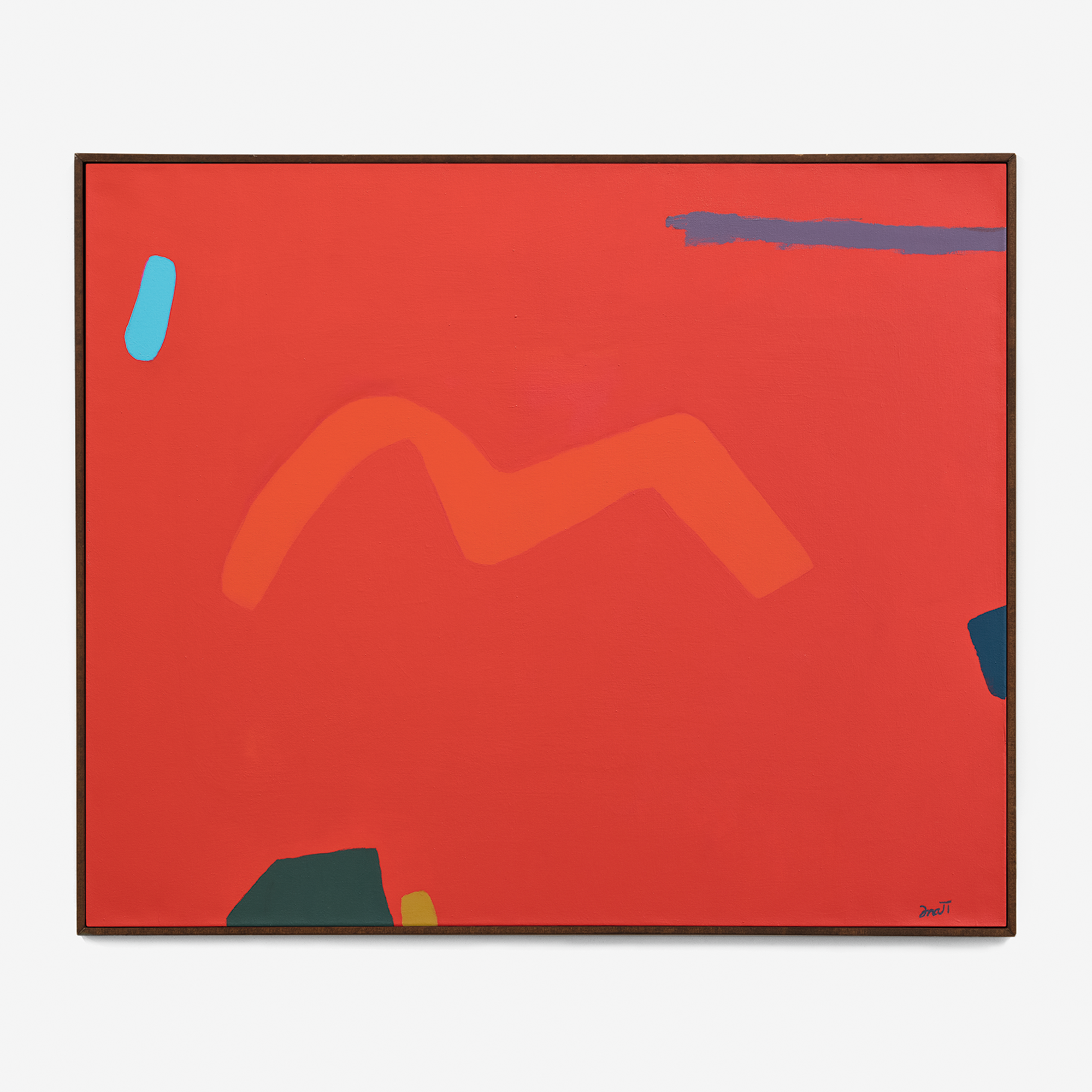
is most notable for her careful control and manipulation of color as a means to create the illusion of space on the 2D support. In the current exhibition, this may be best seen through careful observation of the artist’s Red Triad series (1996). In the three serigraphs, the artist transforms a seemingly flat, red visual field. The inclusion of soft floating forms rendered in icy blues, vermillion, fuchsia, and kelly green suggest a deep and echoing space. Here there is no perspective per say; yet, all the same, the eye vibrates trying to sort out and define the space in which these marks and forms exist. In Red Triad I, an L-shaped vermillion forms hovers in the left of the picture plane, seemingly high above the fuchsia and blue-gray forms that descend diagonally across the composition. This same vermillion and fuchsia, in Red Triad II, are much more difficult to suss out spatially, At one moment the fuchsia soars above the other forms, at another the vermillion. As Fratt herself noted, she creates “a kind of katty-wampus space not restrained by geometry.” And, Fratt’s son, Gregory Fratt, emphasizes a similar sensation. When asked about her approach, he notes, “Many of my mother’s later works especially, but some of her earlier works as well, evolve in front of the viewer as conditions in the environment change as well as the viewers physical relationship to the painting. It is this characteristic feature which my mother uses that allows movement, the nature of time and space, as well as the effects of light to change the surface of the painting creating these ‘phantom colors and shapes’ to appear and disappear. The result adds a spacial richness to the oftentimes minimalist quality to her work.”

Hooligan Creek, 1981, Acrylic on canvas, 85 x 54 in
Mummy Mountain, 2002, Acrylic on canvas, 40 x 48 in

Installation view, colorful . farbenfroh. © Museum Art.Plus
In tracing Fratt’s abstract lineage within a history of Western Art, her work bears much in common with the interplay of color and form seen in Kazimir Malevich’s Suprematist canvases—a departure from many of her contemporaries. As Köhler has noted, Fratt would have been exposed to Suprematism in her early training with Nicolai Cikovsky. Malevich’s subtle, floating squares, all in the pursuit of a sort of universal harmony, have much in common with Fratt’s optical experiments with color and space. Important too was her extensive knowledge of color theory, a topic on which she continued to lecture during her years in Arizona. In particular, her knowledge of Wilhelm Ostwald’s color theory, gained from classes with teacher Karl Knath, likely contributed to her spatial approach to color. In Ostwald’s early primer’s on color he posited models and drawings of a color solid or space achieved through the selective arrangement and use of color. In considering her more direct contemporaries, Fratt’s work bears comparison to Hans Hofmann and his “push and pull” approach, which similarly suggested space through the interplay of color and form. All the same, Fratt’s relative austerity, cool forms, and color selection reject the expressive, bold forms and hues seen in Hofmann’s canvases. In sum, Fratt’s work is deeply rooted in modernist approaches to abstraction, yet the artist blends all of this into a unique and singular approach.
One of the things that perhaps most distinguishes Fratt’s work in abstraction is her cool renderings of form. Amorphous shapes, such as those seen in Dance (1983), at first appear accidental. Yet, they are purposefully shaped to create the lyrical sensation suggested by Fratt’s title. This show also offers an opportunity to view the serigraph Dance and its companion acrylic study. Such a comparison reveals the way in which Fratt worked, in conjunction with Master Printer John Armstrong, to translate her meticulous hand work to the print medium. Hard and soft, gestural yet calculated, Fratt’s compositions are a rich ground for the discovery of painterly opposition. In Hopscotch (1985) we can also see the benefits of her experimentations with serigraphy. A gestural pink spatter at center bears nothing in common with her expressionist predecessors. Instead the mechanical nature of the printing process has rendered what might be dismissed as gestural swipes into a calculated and planned form with precise boundaries. As Armstrong himself noted in an essay on the artist,
“these works belie their simplicity.”
Equally rewarding in this exhibition is the opportunity to view Fratt’s more well-known abstractions in conjunction with other figural studies and landscapes. In Phoenix Symphony Conductor #1 and #2 (1960), Fratt again demonstrates her masterful control of pigment (here Sumi ink) to create purposeful marks and form. In simple strokes, she conveys the torsion of the erect figure as well as the sway of limbs, all in an effort to create a sort of visual rhythm and orchestral viewing sensation. Watercolor landscapes, including St. Bertrand (1964) and Three Sisters Mountains (1971), reveal Fratt’s process in translating the landscape, the first in a more detailed—and one might say traditional—manner and the second in a more subtle impression of color and form. Road to the Mountain (1977), in part, appears to be the synthesis of such observations and process. Here we are met with the particular forms and gestural motifs of her larger abstractions, yet in a composition that, even without the title, reads as the horizon aflame at sunset. Such figural works, much like the abstractions, are almost always minimalist in appearance but assertively complex.
Fratt’s work might dismissively be seen as an easy viewing experience. Too many might glance and acknowledge the delights of color and abstraction, never witnessing the true complexities of her oeuvre. Today especially, studies suggest that the average museum or gallery goer spends just 27.2 seconds in front of a work of art. If I convey nothing else in this essay, I urge you to slow down and to recognize the complexities of Fratt’s oeuvre. The work gathered in this exhibition is especially ripe for careful viewing.

Aria, 1996, Acrylic on canvas, 14 1/8 x 14 in